
Sharpe Ratio Lies: Better Metrics Quant Funds Use to Judge Performance
If you hand your trading algorithm’s performance report to a multi-billion-dollar quantitative hedge fund or a global banking institution, the first thing they will look at is your risk-adjusted return. In the retail trading world, when someone wants to prove their system is profitable, they simply point to their total net profit. They will boast that they doubled their investment capital in a single year.
Institutional finance does not care about your total net profit. Total profit is a meaningless number if the path you took to get there involved catastrophic, account-threatening risks. To measure exactly how much risk you took to achieve your returns, the financial industry has traditionally relied on one supreme metric: The Sharpe Ratio.
Open any broker terminal, backtesting software, or portfolio analyzer, and the Sharpe Ratio will be plastered at the top of the page. It is the gold standard taught in every university finance program.
There is only one problem: The Sharpe Ratio lies to you.
For modern, active traders who utilize asymmetric risk models, the Sharpe Ratio is not just flawed; it is actively deceptive. It penalizes good trading behavior and masks hidden dangers. If you are trying to optimize your trading system to achieve a high Sharpe Ratio, you might actually be engineering your own eventual ruin.
To stop evaluating your portfolio like an amateur and start judging your performance like a proprietary quantitative desk, you need to understand the brutal mathematical flaws of the Sharpe Ratio, and replace it with the advanced metrics that institutions actually use.
The Mathematical Flaw of the Sharpe Ratio
To understand the lie, we must first look at the formula. Developed by Nobel laureate William F. Sharpe in 1966, the ratio is calculated by taking your portfolio’s return, subtracting the “risk-free rate” (like the yield on government treasury bonds), and dividing that number by the standard deviation of your portfolio’s returns.
The core of the equation is Standard Deviation. This is how the Sharpe Ratio defines “risk.” Standard deviation measures how wildly your returns fluctuate from your average return.
This introduces two catastrophic flaws for the active, systematic trader.
Flaw 1: Punishing the Upside Breakout
Standard deviation is symmetrical. It does not know the difference between a massive loss and a massive profit. It only measures volatility.
Imagine you are trading a highly disciplined trend-following system. For a month, your portfolio goes perfectly sideways, suffering small, controlled paper cuts. Then, the market violently breaks out. Your system catches the trend perfectly, and in a single day, your portfolio spikes upward, banking a massive, outsized profit.
As a trader, this is the exact scenario you dream of. You just secured a massive influx of capital. But if you look at your Sharpe Ratio the next day, you will be shocked to see that it actually dropped.
Why? Because that massive, profitable spike increased the standard deviation of your equity curve. The math viewed that sudden upward explosion as “volatility,” and therefore classified it as “risk.” The Sharpe Ratio mathematically penalizes you for making too much money, too fast.
If you optimize your system for the Sharpe Ratio, you will inadvertently train your algorithm to avoid massive, profitable breakouts. You will build a system that takes tiny, frequent profits, which leaves you completely exposed to the second massive flaw.
Flaw 2: The Normal Distribution Fallacy (Ignoring Fat Tails)
The Sharpe Ratio assumes that market returns follow a normal distribution—a perfect bell curve. In a perfect bell curve, extreme events (crashes) are mathematically impossible.
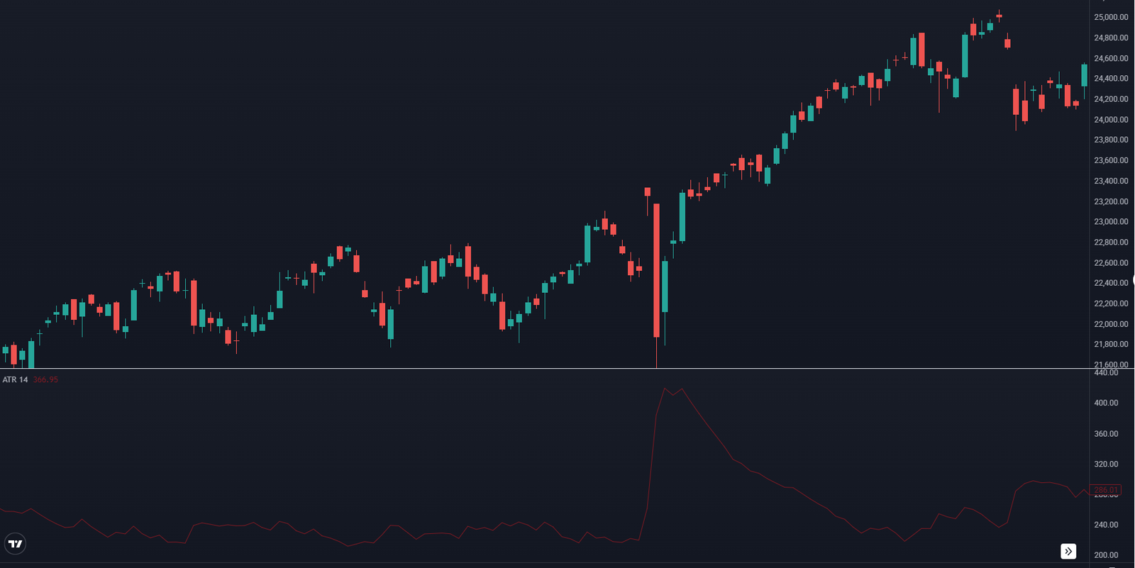
But anyone who has spent a year in the global financial markets knows that the stock market does not follow a bell curve. Markets exhibit what statisticians call “Fat Tails.” A single, unexpected credit crisis, a banking collapse, or a sudden change in monetary policy can cause a flash crash that defies all standard deviation models.
A trading strategy that sells deep out-of-the-money options (collecting tiny premiums every day) will generate a perfectly smooth equity curve. Its standard deviation will be incredibly low, giving it a phenomenal, world-class Sharpe Ratio. It looks like the perfect investment.
But that system is secretly harboring massive, unhedged tail risk. The day a Black Swan event hits the market, that strategy will be completely wiped out in minutes. The Sharpe Ratio is completely blind to this hidden, explosive risk. It acts like an insurance salesman who promises you low premiums because he calculated the risk of a flood using data from a desert, completely ignoring the massive hurricane forming off the coast.
Metric 1: The Sortino Ratio (Fixing the Upside Penalty)
The proprietary trading desks of major quantitative funds quickly realized that treating upward volatility as a negative was destroying their trend-following models. To fix this, they adopted The Sortino Ratio.
Named after Frank A. Sortino, this metric takes the foundational logic of the Sharpe ratio and applies a crucial, logical correction. Instead of dividing your returns by total standard deviation, the Sortino Ratio divides your returns exclusively by Downside Deviation.
The math is instructed to completely ignore any volatility that results in a profit. It only measures the volatility of your losses.
This is the ultimate metric for an asymmetric trader.
Let us revisit the core fixed-point geometry we discussed in previous strategies. If you build a trading system using a strict 400-point target and a hard 200-point stop loss, you are forcing the market into an asymmetric profile.
- Every time you lose, you lose exactly 200 points. The downside volatility is mathematically capped and rigidly controlled.
- Every time you win, the asset explodes upward for 400 points.
Because your upside movements are mathematically twice as large as your downside movements, your standard deviation will be artificially high, completely destroying your Sharpe Ratio. However, if you plug those exact same trades into a Sortino Ratio calculator, your score will be phenomenal.
The Sortino Ratio recognizes that your 400-point winners are not “risk.” It isolates the tightly clustered 200-point losses, recognizes that your downside is heavily protected, and accurately reports your system as highly efficient. If you are comparing two different trading strategies to decide where to allocate your capital, you must throw away the Sharpe Ratio and compare their Sortino Ratios. The higher the Sortino, the cleaner your downside protection.
Metric 2: The Calmar Ratio (The Drawdown Reality Check)
While the Sortino Ratio fixes the volatility problem, it still does not fully address the psychological pain of holding a losing portfolio.
In the real world of trading, your biggest threat is not standard deviation. Your biggest threat is Maximum Drawdown.
Maximum Drawdown is the measurement of the largest single drop in your account equity from an all-time high to a subsequent low. If your account grows to 100,000, and then suffers a string of losses that drops the balance to 60,000 before recovering, your Maximum Drawdown is 40%.
For a retail trader, a 40% drawdown is often a psychological death sentence. It induces panic, forces revenge trading, and causes the trader to abandon the strategy. For an institutional fund utilizing margin and credit lines, a massive drawdown can trigger forced liquidations by their prime brokers.
To measure performance against the brutal reality of drawdowns, quantitative analysts use The Calmar Ratio.
Created by Terry W. Young, the Calmar Ratio is incredibly straightforward. It takes your Annualized Return and divides it by your Maximum Drawdown over a specific period (usually 36 months).
If Strategy A returns 50% a year, but regularly suffers terrifying 40% drawdowns, its Calmar Ratio is a meager 1.25. If Strategy B only returns 25% a year, but its Maximum Drawdown is a tightly controlled 5%, its Calmar Ratio is an elite 5.0.
A quantitative hedge fund will choose Strategy B every single time. They know that a system with a 40% drawdown is structurally broken. It means the system’s risk parameters are too loose, and it is only a matter of time before a 40% drawdown becomes a 100% total wipeout.
By utilizing the 200-point fixed stop loss rule on every single trade, you are actively managing your Calmar Ratio. Because you never allow a single trade to exceed the 200-point threshold, you prevent catastrophic, account-killing outliers from infecting your equity curve. A high Calmar Ratio proves that your returns are not the result of reckless gambling; they are the result of calculated, heavily armored execution.
Metric 3: The Ulcer Index (Measuring the Duration of Pain)
The Calmar Ratio tells you how deep your drawdown was, but it leaves out one critical variable: Time.
In the financial industry, capital velocity is everything. If your money is tied up in a losing position, it cannot be used to generate new wealth. Opportunity cost is a silent killer.
Imagine two trading systems that both suffer a 20% Maximum Drawdown.
- System A drops 20% in one week, but immediately catches a new trend and recovers back to all-time highs within 14 days.
- System B drops 20%, and then grinds sideways in a miserable, choppy market for eight entire months before finally recovering.
Both systems have the exact same Calmar Ratio. But any trader who has lived through an eight-month drawdown knows the psychological torment of System B. Eight months of staring at a red screen will break the discipline of almost any human being.
To quantify the psychological toll of prolonged drawdowns, elite quantitative analysts use The Ulcer Index.
The Ulcer Index measures both the depth and the duration of a drawdown. It calculates how far your account has fallen from its peak, and exactly how many days it stays below that peak. The longer your capital remains trapped underwater, the higher the Ulcer Index climbs.
This metric is vital because it exposes systems that rely on “hope.” Many retail traders build mean-reversion strategies where they buy falling assets, refusing to use stop losses, assuming the market “always comes back.” Eventually, the market might come back, but it might take two years. During those two years, their Ulcer Index goes parabolic, their capital is frozen, and they miss out on dozens of other profitable trends.
If you are backtesting your technical setups, you must analyze the recovery time. If your system historically takes 180 days to recover from a drawdown, you must honestly ask yourself if you have the psychological fortitude to execute trades flawlessly for six months while making zero new equity highs.
Abandoning the Quest for the Smooth Equity Curve
The reason the Sharpe Ratio became so universally popular is that it sells a comfortable illusion. It tells investors that a “perfect” investment is one that moves in a smooth, straight, unwavering line upward.
This illusion forces system developers to curve-fit their data. They add twenty different indicators, filter out all the noise, and design an algorithm that produces a beautifully smooth, low-volatility equity curve in the backtest.
But when that highly optimized, smooth system is unleashed into the live market, it inevitably collapses. It collapses because the live market is not smooth. The live market is chaotic, violent, and inherently asymmetrical.
You must stop trying to build a trading system that looks pretty to an accountant. You must build a system that is robust enough to survive a warzone.
This requires you to embrace upside volatility while ruthlessly decapitating downside risk.
When you abandon percentage-based stop losses that shift and fluctuate with market volatility, and replace them with the unyielding mathematics of a fixed 400-point target and a 200-point stop loss, you are making a conscious choice. You are choosing to fail the Sharpe Ratio test. Your equity curve will not be a smooth, straight line. It will have jagged upward spikes as your 400-point winners trigger, and it will have flat, tightly clustered sideways periods as your 200-point losses are triggered and contained.
You will have high standard deviation. A traditional finance professor will look at your returns and tell you that your system is “too volatile.”
But when you run those exact same returns through the metrics that actually matter—the Sortino Ratio capturing your massive upside asymmetry, the Calmar Ratio highlighting your incredibly shallow drawdowns, and the Ulcer Index proving your rapid recovery times—the reality of your edge will be undeniable.
Stop judging your performance by the outdated standards of traditional portfolios. Track the metrics that measure survival, control your downside fixed points flawlessly, and let the upside volatility compound your wealth.